


Primenet identity and brand
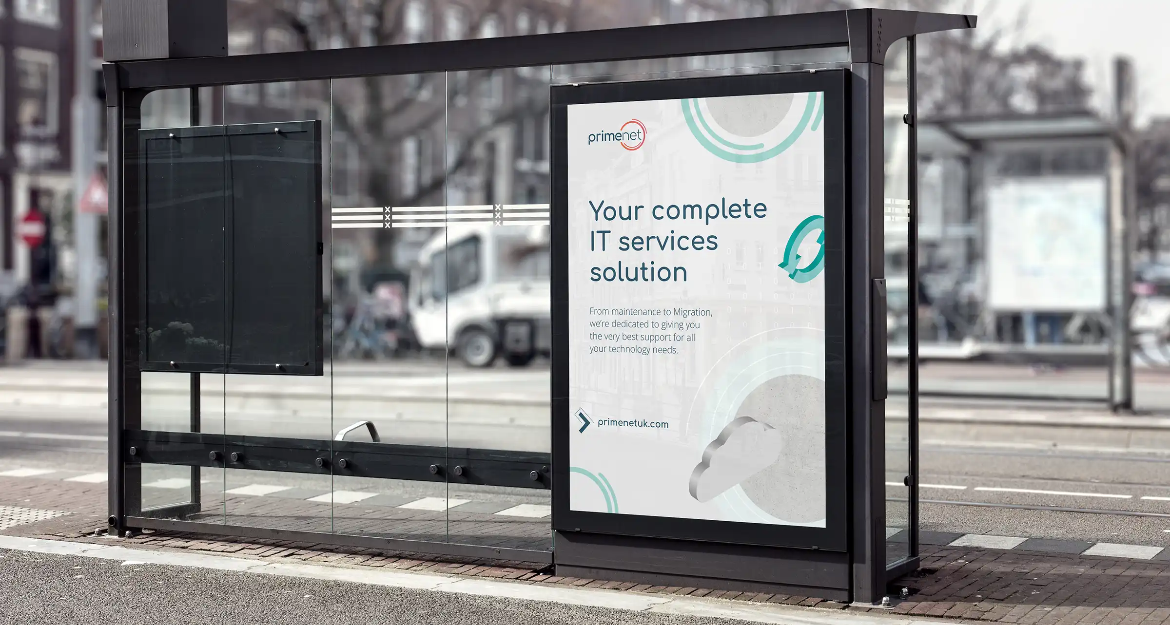
For their new identity, we created a logo that nods to their connections, their full-service portfolio and a familiar, welcome symbol: WiFi connectivity. Even better, using gentle curves and a softer, rounded font now gives the impression of a smile, referencing their trusted, customer-led approach.


But there was more where that came from. We brightened up their background colour with a fresh new palette, added 3D illustrations for contemporary standout, and even devised a whole suite of brand materials – from document templates to brand bible, and icons to presentations and web designs. Now, Primenet has a logo, primary colour and assets for each of their sectors, as well as an overall identity – which needed 360 thinking of our own.


Want to see more?
GET IN TOUCH
Start your project now